
This site contains affiliate links, view the disclosure for more information.
Are you a seasoned web designer looking to refine your skills?
or
Are you a business owner looking to enhance your online presence?
Either way, this article intends to provide you with some valuable insights into the fundamental building blocks of effective web design strategy.
In the present-day world, users’ expectations from sites online are higher than ever before as of which, mastering the fundamentals of web design strategy is paramount if you want to stay ahead of the competition and deliver exceptional digital experiences to people online.
As the gateway to your brand’s online identity, your website, if well-designed, serves as a powerful tool for engaging visitors, driving conversions, and achieving business objectives. From intuitive navigation to captivating visuals and persuasive calls to action, every aspect of your web design plays a crucial role in shaping user perceptions and guiding their interactions.
Let’s look at some of the very basic elements resolving and optimizing your site for which can make your web design strategy effective.
Table of Contents
ToggleResponsive Design
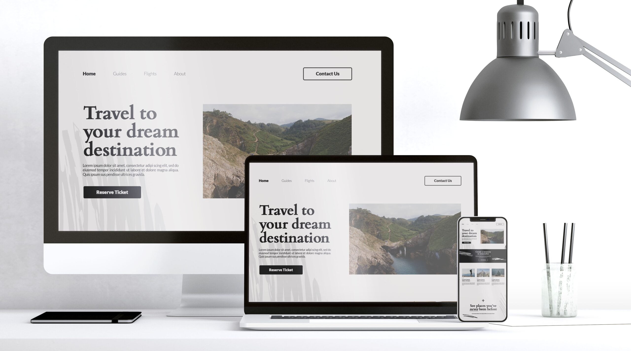
The present-day digital landscape where smartphone users usually dominate the online system requires the web design to be mobile responsive. Also, most of the business today occurs on smartphones rather than traditional desktops and tablets.
The idea behind mobile responsiveness is to retain the visitor session on your site longer by keeping them engaged. Retaining an audience on your website for a longer period increases the chance of them interacting with your website and doing business with you.
To accomplish an effective mobile responsive web design, what people often forget is that you need to consider factors like the website loading speed and the overall functionality of your website because slow speeds are simply non-negotiable when it comes to providing a better user experience in a mobile responsive web design.
Related: Role of Core Web Vitals in SEO: Prioritizing UX for Search Rankings
Visual Hierarchy
Visual Hierarchy caters to a user-friendly design user interface and the principle behind it is to make the visual elements on your webpage appear in the order of their importance.
All this helps in making the ‘navigation through your website’ process easier for your audience. With easy navigation available, users are encouraged to engage and interact with your site.
Visual design plays a crucial role in capturing your users’ attention and guiding them towards conversion. One of the key elements of an effective visual design for the web is choosing the right theme. At ThemeIsles you can find a wide range of professionally designed and customizable themes that are not only visually stunning but also optimized for performance and offer enhanced UX.
Know that a user-friendly design of any website is a factor that Search Engines take into consideration in generating the SERPs. This simply means that if your website does not have a user-friendly design, it will affect your SEO ranking on the SERPs pages.
Once you have the right theme in place, here are some additional user-friendly elements you can implement to make your web design strategy effective and prevent your SEO or organic rankings from collapsing.
- Implementing a webpage design that appeals to human aesthetics
- Home page with clear site navigation
- Site search option
Clear CTAs
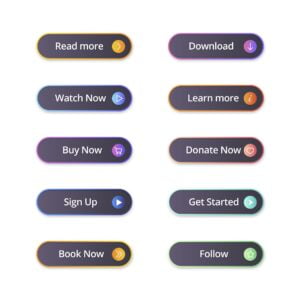
Embedding Calls-to-Actions also serves a key role in adding user-friendliness to your site. Not only that, but the entire click-to-convert journey usually gets complete only when a user interacts with the CTAs on your site to take action.
No CTAs on your site means that you are:
- Making your users feel directionless as you are not pointing or guiding them toward the steps to be taken to accomplish something. This makes your users feel confused and frustrated, ultimately increasing your webpage’s bounce rate and reducing your conversion rate.
- Missing on conversion opportunities because no CTAs on your webpage indicate that there exist no prompts that convince users to take a desired action like making a purchase, signing up for a newsletter, or maybe accessing some freebie or information source. Thus your website’s potential conversion opportunities are missed, thereby, diminishing the effectiveness of your webpage in achieving the desired goals
- Providing poor UX to users on your website due to a lack of smooth and intuitive UX when the absence of CTAs disrupts the flow of navigation and makes it difficult for users to complete desired actions.
- Making ineffective communication with your site visitors with the absence of CTAs that communicate the desired action clearly and persuasively.
Thus the need to strategically include CTAs on your website is evident for your web design strategy to be effective.
Simplified Navigation
What would be your reaction when using a site that lacks proper navigation or has no nav at all? You’ll become frustrated in no time!
At its core, the simplified navigation in web design aims to streamline the browsing journey for users by making it effortless for them to find the information or products they seek.
Simplified navigation on your site can be implemented by decluttering the nav menu and getting your content organized logically. That way, regardless of a user’s familiarity with your site, they can easily navigate through your site.
With simplified navigation in place, the bounce rate of your site can be improved by keeping users engaged and preventing frustrations and confusion.
By strategically incorporating CTAs within your site’s navigation structure, you can gently guide your users toward a conversion point without getting them overwhelmed with any unnecessary distractions.
Page Load Speeds
As discussed in the responsive design section, the loading speed of your website plays a critical role in aligning your web design strategy to meet the impact rate of maximum conversions as well as in the SEO ranking of your site.
As an internet user, you know that we have become accustomed to receiving the requested information over the internet in a timely fashion. Various research and case studies have shown that as page loading speed increases by seconds, the bounce rate increases to an extent where the overall conversion rate decreases by as high as 95%.
While avoiding fancy flash items, music, and large file-size videos can improve the speed-friendliness of your site, here are some best practices you can consider implementing for improving your site speed.
- Optimize uploaded media files on your site
- Make Use of a content delivery network (CDN)
- Minimize HTTP requests
- Enable Caching
- Make less use of plugins
- Use web optimization tools
I implemented all these simply with the installation of an all-in-one LiteSpeed Cache for WordPress plugin. If you want help configuring the plugin, refer to detailed article on this: Role of Core Web Vitals in SEO: Prioritizing UX for Search Rankings.
Using cloud hosting rather than traditional web hosting for your website is yet another possible and emergingly effective way of making the page loading speeds on your website lightning-fast. While this solution requires a little investment when you shift from your traditional web hosting to cloud hosting servers, trust me this expenditure would be worth it because of the unparalleled reliability and scalability you get with cloud-based hosting.
One of the best-performing managed cloud-based hosting providers is Cloudways which helps you craft a user experience that captivates and converts by saying goodbye to sluggish servers, offering a seamless browsing experience to your site visitors that compels them enough to keep coming back for more!
Incorporating Psychology in Web Design and How It Affects Site SEO?
Creating content that compels your users to keep coming back for more or simply stay on your website for a longer time duration is a must in web design. After all, it is usually some information that people seek when they land on your site surfing the net. And if your content is not interesting or appears unappealing and boring to visitors, they won’t even fancy maintaining eye contact with it for a little while, they’d just leave!
For this purpose, the content on your site needs to be interesting so that it serves the purpose of building trust with your site visitors and making you look expert in your field.
One way to make your web design content interesting is to incorporate psychology into your web design. By applying psychological principles to design elements in web design, like the color scheme for your website, typography, and layout, you can influence user perception, emotions, and decision-making processes.
Importantly, the psychological aspects of web design also intersect with your site’s SEO rankings. Websites prioritizing user experience, engagement, and satisfaction are more likely to rank higher in search engine results pages (SERPs).
Factors like bounce rate, time on site, and click-through rate are all metrics that search engines consider when determining the relevance and quality of a website.
Therefore, by creating user-centric designs that prioritize clarity, intuitiveness, and value, designers can indirectly improve SEO performance and drive organic traffic. Here’s what you need to consider to create user-centric designs.
Color Psychology
Colors evoke emotions, moods, and perceptions in human beings. For instance, warm colors like red and orange are known to be associated with energy, excitement, and urgency. That’s why you’d often see that in marketing, CTAs are built keeping in mind the warm color psychology
Cool color tones like blue and green portray calmness, trust, and serenity, making them suitable for websites that exist to create credibility or promote relaxation. Strategically incorporating colors in your web design can help you influence user behavior, engagement, and brand perception, all resulting in an improved UX on your site.
Typography
The arrangement, layout, and appearance of text on your webpage that conveys information, establish hierarchy among page elements, and shapes the overall visual identity of your brand website comes under the typography style.
Your choice of font, font size, spacing, as well as font alignment impacts readability, mood, and brand personality. By making use of typography fonts that align with your website’s goals and target audience you can:
- Enhance readability
- Evoke desired emotions
- Create a cohesive and memorable brand identity
Social Proof
Often, in fact, most of the time, it is the testimonials of your products or services that convince visitors on your site to convert. This is simply because social proof elements like customer reviews, testimonials, UGC (user-generated content) as well as social media endorsements can help your brand build trust, credibility, and authority with users.
By placing social proof on your site, you basically alleviate your site users’ doubts, reassuring and encouraging them to take desired actions such as making a purchase or signing up for a service.
Scarcity and Urgency
Leveraging the fear of missing out (FOMO) to prompt immediate action from users is yet another powerful web design strategy that works wonders. Scarcity implies creating the perception of limited resource availability, whereas, urgency instills a sense of time pressure like a close approaching deadline.
By making use of techniques like countdown timers, limited-time offers, low-stock notifications, and last-chance offer alerts, you can trigger a sense of scarcity or urgency for site visitors and users, thereby, compelling them to act quickly before they miss out on valuable opportunities.
By strategically incorporating scarcity and urgency techniques in your CTAs, and promotional banners, you can convince users to engage, convert, and drive sales to your brand.
In essence, incorporating psychology in your web design strategy not only enhances user experience and conversion rates but also positively impacts SEO, contributing to the overall success and effectiveness of a website.

A/B testing and data-driven design

Every website owner wants to achieve the best results by employing effective web design strategy in place so that their website offers a great user experience to visitors and users along with perfect features, smooth design, and functionalities.
However, several dynamics control the overall success of websites online so there is no one fixed, hard, and fast rule to success. Rather, the success of websites online is often bound to multiple paths. And to figure out which path suits best with the website’s overall success, A/B testing is the key.
A/B testing or split testing is an important tool in web development with the help of which you can test elements like headlines, call-to-action buttons, and page layouts by creating multiple versions of these elements and randomly directing some users to sample A and some to sample B. By studying the variations in the user engagement and conversions received by both samples, you can determine which version performs better.
A/B testing is a powerful tool in a web design strategy that provides you valuable insights into user behavior on your website. These insights can be utilized to enhance UX which leads to more conversions, improved business results, and higher audience satisfaction; thus a data-driven design strategy.
Advantages of A/B testing in refining web design strategy elements for optimal conversion rates
A/B testing allows you to run controlled experiments on your website and in return get insights and information into the choices and behavior of your site users which ultimately helps your site in achieving optimal conversion rates.
Below we will discuss the advantages of A/B testing in refining web design strategy elements for optimal conversions.
- It helps you improve the user experience on your website
- Being a data-driven strategy process, you can make use of the data obtained from A/B testing to make smart decisions about the required changes or updates needed on your web pages. This saves you the trouble of relying on your gut instincts only. That way, you’d be relying on real-time user feedback and their behavior.
- Through A/B testing, you can get your conversion rates to skyrocket when you get to identify the most successful approaches to success that actually work with testing. These approaches include testing the elements on your landing pages or checkout page to identify elements or areas where in the conversion journey users tend to abandon your site without taking any action. Improving the highlighted areas or elements as of A/B testing, you can increase the number of users completing the desired action like making a purchase or signing up for a newsletter, thus increasing your overall conversion rate.
- A/B testing aids your website’s ongoing development process by enlightening you with insights through testing about what web elements need modification so that your website remains effective and relevant for users.
- A/B testing allows you to stay ahead of the competition
Now that you’ve understood how A/B testing is crucial to observing user behavior patterns on your website, and to creating personalized experiences tailored to your audience needs, you also need to know what key metrics to track and analyze in A/B testing for a web design strategy that converts.
Key metrics to track and analyze in A/B testing for web design strategy optimization
Before launching an A/B testing campaign for your website, you’ll need to first know which key metrics you need to test or analyze for your website. Here’s the list of metrics that can be tracked and analyzed with A/B testing or split testing:
Bounce Rate
Definition – The percentage of visitors on your website that navigate away without interacting with the elements on your website
Why Track and Analyze this? – Your site’s bounce rate indicates the level of engagement and relevance of its content to visitors. High bounce rates may be a signal that your site design and content are not resonating with the audience on the site.
How to Analyze it? – Monitor the bounce rate corresponding to both A and B test variations to figure out which design leads to lower bounce rates and higher engagement.
Conversion Rate
Definition – The percentage of visitors on your website that complete a desired action like buying a product, filling out a contact form, or signing up for a newsletter.
Why Track and Analyze this? – This is one of the fundamental metrics that you’ll be measuring with A/B testing as it directly evaluates the effectiveness of your design variation, for samples under testing, in driving user actions and conversions.
How to Analyze it? – Monitor the conversion rates achieved corresponding to both A and B test sample variations to determine which design helped convert more visitors into customers or leads.
Click-Through Rate
Definition – The number of site visitors who click on a specific link or a web element on your site.
Why Track and Analyze this? – This is also a key metric to measure with A/B testing as it helps evaluate the effectiveness of calls-to-action, menu navigations, as well as other interactive elements that guide site users toward any desired action on your website.
How to Analyze it? – Monitor the CTR of key elements between test sample A and sample B to assess which design encourages more user interactions.
Average session duration
Definition – It is the average amount of time visitors spend on your webpage during their single session.
Why Track and Analyze this? – This is useful in understanding your site users’ engagement and interest in the content or your webpage design.
How to Analyze it? – Evaluate the average session durations of sample test variations to determine which design keeps users engaged for longer a period of time.
Goal Completeness
Definition – It is defined as the number of times users on your site successfully accomplish predefined goals, such as completing a purchase or submitting a form
Why Track and Analyze this? – Goal completions directly measure the effectiveness of your webpage in fulfilling specific objectives.
How to Analyze it? – Track the number of goal completions for each test variation to identify which design drives more successful conversions.
Once you identify which specific metric you need to track and analyze, specific to your website, you’ll then need to set up an A/B testing campaign.
Lead generation software like OptinMonster can help you set up your lead generation campaign in no time within which you can utilize the built-in split testing feature to test out variations.
You can refer to their detailed article for setting up a split testing campaign with OptinMonster for your web pages.
Tracking and analyzing key metrics in A/B testing is essential for optimizing your web design strategy for maximizing performance and conversions. By understanding the impact of design variations on conversion rates, engagement metrics, and goal completions, you can make informed decisions that will help in making your site more effective and user-friendly.
Mobile Optimization
With the majority of internet surfers accessing the web through smartphones, you need to prioritize mobile optimization for your website so that it provides a seamless and engaging experience to your audience.
Other than the user experience, mobile optimization also helps in increasing the conversion rates on your site. Let’s explore the importance of mobile optimization in the era of smartphone dominance and discuss techniques for designing mobile-friendly websites to maximize conversions.
Importance of mobile optimization in the era of smartphone dominance
Smartphones have more or less changed the way people interact with content available to them online. From social media browsing to product shopping, users have become accustomed to fast, intuitive, and responsive experiences delivered to them right in the comfort of their smartphones.
As such, mobile optimization of your website has become crucial to staying competitive and meeting the evolving needs of your audience. Incorporating mobile optimization in your web design strategy you get:
- Increased conversions – Incorporating mobile optimization in your web design strategy helps remove the barriers to conversion by providing smooth user journeys. This is simply because mobile users on your site will like to engage with and convert only when your site provides them an easy navigation, quick loading speed, as well as relevant and compelling content. This caters to a win-win strategy for your website when you get an opportunity to capitalize on your conversion rates and boost revenues one way or the other.
- Improved Search Engine rankings – A website that is not optimized for mobile users is likely to receive lesser attention (lower visibility and rankings) from search engines compared to websites that are built with a mobile responsive design. So, to make your website receive maximum SE attention and be widely visible online, you need to give serious thought to incorporating mobile responsiveness design on your website.
- Enhanced user experience – Any user on your website will depict a higher retention rate and increased brand royalty only when your website design offers them an enjoyable browsing experience regardless of the device they might be using. Mobile responsive design can help you accomplish exactly that.
Techniques for designing mobile-friendly websites to maximize conversions
Once you decide to incorporate a mobile responsiveness feature into your web design, it is essential to prioritize usability, performance, and conversion optimization. Here are some techniques that might prove beneficial:
- Build your website for speed as it is the biggest factor of any website in ranking it higher in search rankings and for optimal user experience,
- Add an easy navigation interface for users to have a smooth click-to-conversion journey
- Make it secure and provide a safe environment to your site users so that they can trust your platform and transact using the authorized payment gateways securely whenever necessary.
- Add a search function so that it becomes easier for your users to find what they are looking for without any bother.
- Strategically guide your users with clear call-to-actions (CTAs) to get the desired result like signing up for a newsletter, making a purchase, etc. This also does not mean that you overdo it and overwhelm your site visitors with multiple CTAs resulting in them getting confused and leaving your website for good.
- Consider a clean font with a best-fit font size that adjusts well on both mobile and desktop screens so that your site is mobile responsive and includes a well-structured layout for desktops as well.
Mobile-specific considerations for CTAs, navigation, and content presentation
Although overall mobile optimization strategies have already been discussed so forth, however, there are several mobile-specific considerations that you need to keep in mind specifically when designing navigation, CTAs, and content presentation for your mobile-responsive website. These mobile-specific considerations include the following:
- Thumb-friendly navigation – This requires you to place important navigation links within easy reach of your site users’ thumb to enhance usability and reduce frustration.
- Condensed content – Most of the time you need to hide certain elements on mobile devices or tablets when making your website mobile responsive. This is necessary because mobile screens usually have limited space. So, it becomes crucial to prioritize and condense content for optimal user readability.
- Clear and visible CTAs – CTAs on your mobile responsive site should be prominently displayed and easy to tap with a finger for users on your site. You can use contrasting colors, ample whitespace, and large, legible fonts to make your CTAs stand out and encourage users on your site to take action.
After understanding these 8 basic components that make for an effective web design strategy, it’s time that your learn about the user behavior on your site and how to track analytics related to it. This is important when you want to design your web strategy that optimized for maximum impact level.
Conclusion
Wrapping up, in learning about basic elements of effective web design strategy it is clear that the journey towards a successful online presence is muti-faceted and requires a harmonious blend of aesthetics, functionality, and strategic vigilance.
From the critical importance of responsive design that meets with your site users expectations regardless of the device they get online with, to the necessity of intuitive navigation that guides them through your digital space with ease, each component plays a pivotal role in sculpting a web experience that resonates deeply with your audience.
Coupled with engaging content that speaks directly to the needs and interests of your visitors, along with a keen attention to SEO strategies, a well-crafted web design strategy not only captivates but converts.
As we continue to navigate the ever-evolving digital landscape, remember that the foundation of any effective web strategy lies in understanding and implementing these core principles.
By doing so, you set the stage for a digital presence that not only stands out in a crowded online world but also achieves your business goals, fostering growth and building lasting connections with your audience.


Take it to your Inbox!
Subscribe to my Newsletter
Never miss the Tips, Tricks, and Insights that I share on my site.
I am really inspired together with your writing talents and
also with the format on your weblog. Is this a paid theme
or did you modify it yourself? Anyway keep up
the nice quality writing, it is uncommon to look a great weblog like this one these days..
Thank you for your comment and appreciation!
No, it is not a paid theme that I am using for this website.